Business Cards
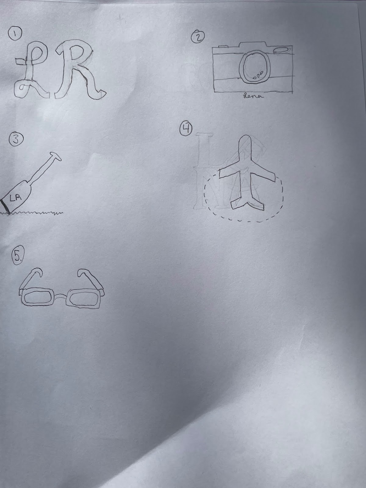
I really enjoyed this project as business cards are very important when you want to make connections with people. The first business card I made was the black one with the yellow logo. For the front of the card I decided to put the logo on the left and my name, major, and contact information on the right. For the back of it I just put the logo in the middle. I chose to make the background of the card black to make the yellow stand out. When creating the text I decided to put my name in white to make it stand out and then did the rest of the text in yellow so that it went with the color of the logo.
The second card I did was the pink one. For this one, I chose a dark pink background so that it went with the pink logo yet let the logo stand out more. I did the same layout as the first card yet this time only put the ad/pr part in a lighter pink to match the logo. I also used a different font to make it a little more mature and fancier.
The last business card I made was the blue one. I did the same thing as the pink one and made the background a little bit darker than the logo. For this one I had a different layout as I decided to put the logo in the middle of the front of the card and put the text around it. I decided to make my name a little larger than the rest of the text and put it in black so that it went with the outline of the logo and stood out amongst the other text on the card. When putting the contact info on the card I made it a little smaller than my name and put it in white font. I also put the Ad/PR part in the same size and color font as the contact info but spread it out so that the Ad part was on the left of the logo and the PR part was on the right. I did this so that to would stand out and show what I offer on the Business card.


Dear, Lena
ReplyDeleteGreat job on this project! First I want to say that I really like what you did for your logo, its very different. Also, I like how you made simple backgrounds because it makes all of them go really well together.
Lena, I really love your business cards. The color schemes you chose really caught my eye. They are simple and easy to read. I feel on the back there is a little bit of unused space that could be filled with more text. Overall, great job!
ReplyDeleteHi Lena,
ReplyDeleteI really like how your business cards turned out. First, I love how much explanation you put into her blog post for this project. It really helps us who are looking at it understand why and what you did. I like how you chose to have simple backgrounds, as this made the logo and other elements pop. Nice job.
Hi Lena,
ReplyDeleteGreat job in the business cards. You did a great job.I like the colors you used and the design. It goes well together. Nice Job!