Posts

Showing posts from October, 2021

Self Portrait Poster

Image
  For the Self Portrait Project, I chose to go with Women's Rights as it is something that I believe in. When creating it I used the pen tool to create each shape and used many layers in order to get the best outline possible. The first part of the project where we just had to create our self-portrait took me around three and a half hours. The colors I chose for the background and for my top were based on what I was wearing and the background of the photo which is the sky. it was definitely hard creating the self-portrait as I had to make sure the lines were perfect and it all came together. I didn't add every detail from the original photo because I felt like that would take away from the final portion of the project and it would take me way longer to complete.  For the propaganda part of the project, I decided to keep the light blue background as I felt it went well with the other colors. I also kept the color of my shirt and changed the color of the sunglasses to match the s

Logo

Image
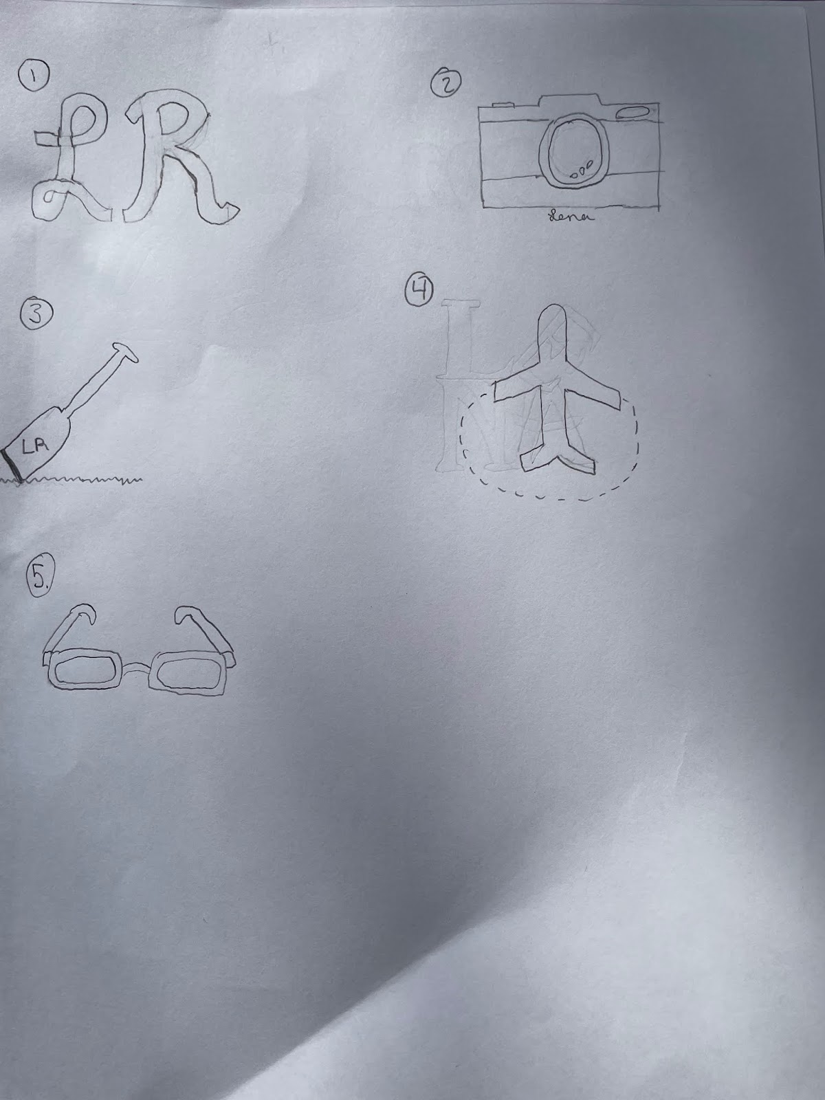
  For my logo, I ended up not going with any of my sketches because they were either too complex or were too simple. When creating my logo in Illustrator I decided to my initials because my name is a part of who I am and I used two pins to represent the two places I lived which are Philadelphia, PA, and Tampa, FL. I also connected the pins to each other to symbolize my move and how the two cities are a part of who I am. I used the text tool to create my initials and used the circle tool for the top of the pins and the background of my logo. for the bottom part of the pin, I used the line tool. When creating the curve that connects the pins I used the curve pen tool and the eraser tool to make the line seem like steps to each place. For the colors I chose them based off of both meaning and what I thought looked good together and fit my personality. For the blue logo, I chose to do pale so that the other parts stood out more and I chose green for the pins to symbolize the colors of the e

Calligram

Image
  In the letter to myself, I mostly asked myself questions so I could reflect on what my life has been like and if I made the decisions I thought I would now. I am a very indecisive person so I tried to look at where I see myself in my future versus what my future is actually gonna be like.  For the image I decided to go with a heart as it represents the love I have for the world around me and everything I have done in my life. I don't regret anything I have done and have always looked passed the bad times.  I created the heart by taking a square and turning it 45 degrees. After turning it 45 degrees I used the pen tool to arch the top sides of the square to make a heart. When choosing the font I chose noteworthy because I really liked how the font looked and thought it fit how I am as a person. I also chose to make sections of my letter different colors to emphasize all the colors that I like and just to make it seem more colorful and playful. 

Illustrator Tutorials

https://youtu.be/3GzumUieDPY This first video is very short and quick yet it introduces Illustrator nicely. The creator of the video gets right into showing us how to use certain tools and where you can find them. He shows us the most basic tools like the rectangle tool and shows us where to find it and how to change it up both with color and size. Another tool he shows us is the star tool and how to use that which I found interesting since it seems extremely easy to make. All you have to do when creating a star is press the up and down keys to add or decrease the number of points you want. He also shows the difference between the selection tool and the deselection tool and what the deselection tool does. The creator gets through a lot in just five minutes.  https://www.youtube.com/watch?v=UqjZR_v37K8 The second video here is a more lengthy video than the first. This video is nice because the woman goes much slower than the man in the first video. In the video, she first starts off by