Logo
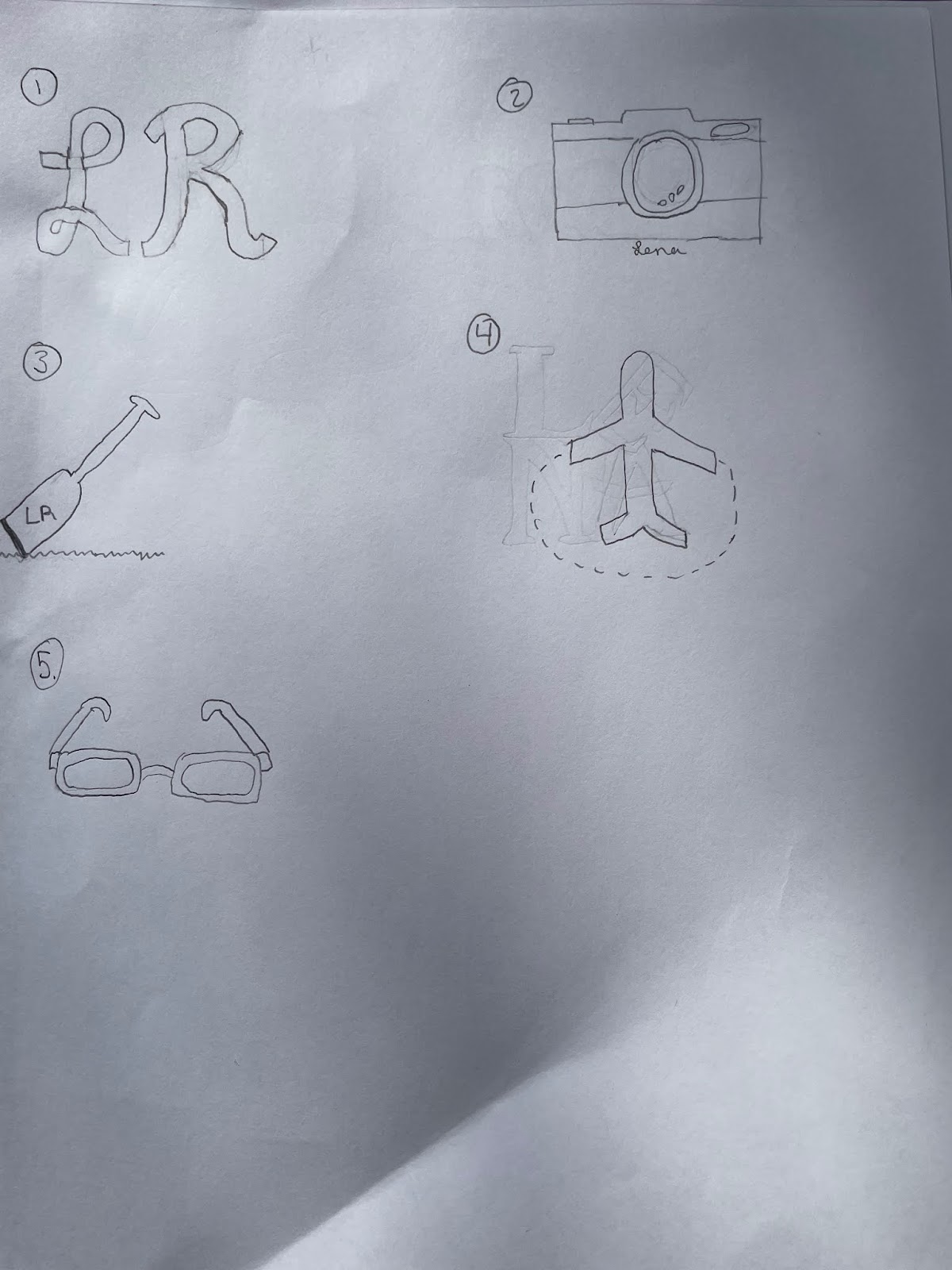
For my logo, I ended up not going with any of my sketches because they were either too complex or were too simple. When creating my logo in Illustrator I decided to my initials because my name is a part of who I am and I used two pins to represent the two places I lived which are Philadelphia, PA, and Tampa, FL. I also connected the pins to each other to symbolize my move and how the two cities are a part of who I am. I used the text tool to create my initials and used the circle tool for the top of the pins and the background of my logo. for the bottom part of the pin, I used the line tool. When creating the curve that connects the pins I used the curve pen tool and the eraser tool to make the line seem like steps to each place. For the colors I chose them based off of both meaning and what I thought looked good together and fit my personality. For the blue logo, I chose to do pale so that the other parts stood out more and I chose green for the pins to symbolize the colors of the earth. When doing the Yellow logo I chose a pale yellow so the initials and pins could stand out and I used red for the pins because in maps that are typically the color of pins. For the pink logo, I decided to go with a pale pink background and chose a darker pink stroke around the circle and letters to make them pop a little more. I chose purple for the pins because I felt like purple and pink are a good color combination.


Comments
Post a Comment