Tag Brush
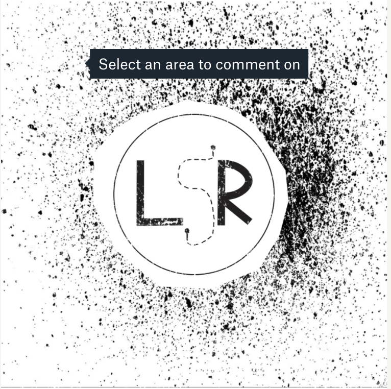


I really enjoyed working on this project especially since we went over it in class. For this I took my black and white logo and added scratches and negatives on top of it. When putting the scratches and negatives on top of the logo I changed the opacity so that it would not cover the
logo. I also changed the positioning to make it more cohesive with the logo. I didn't really change much when it came to the negatives over my logo besides the opacity. For the scratches I changed the rotation so that it flowed with my logo more and didn't take away certain parts of my logo. When choosing the tag brush color I went with a light blue because I thought it looked nice.
logo. I also changed the positioning to make it more cohesive with the logo. I didn't really change much when it came to the negatives over my logo besides the opacity. For the scratches I changed the rotation so that it flowed with my logo more and didn't take away certain parts of my logo. When choosing the tag brush color I went with a light blue because I thought it looked nice.
For


Comments
Post a Comment